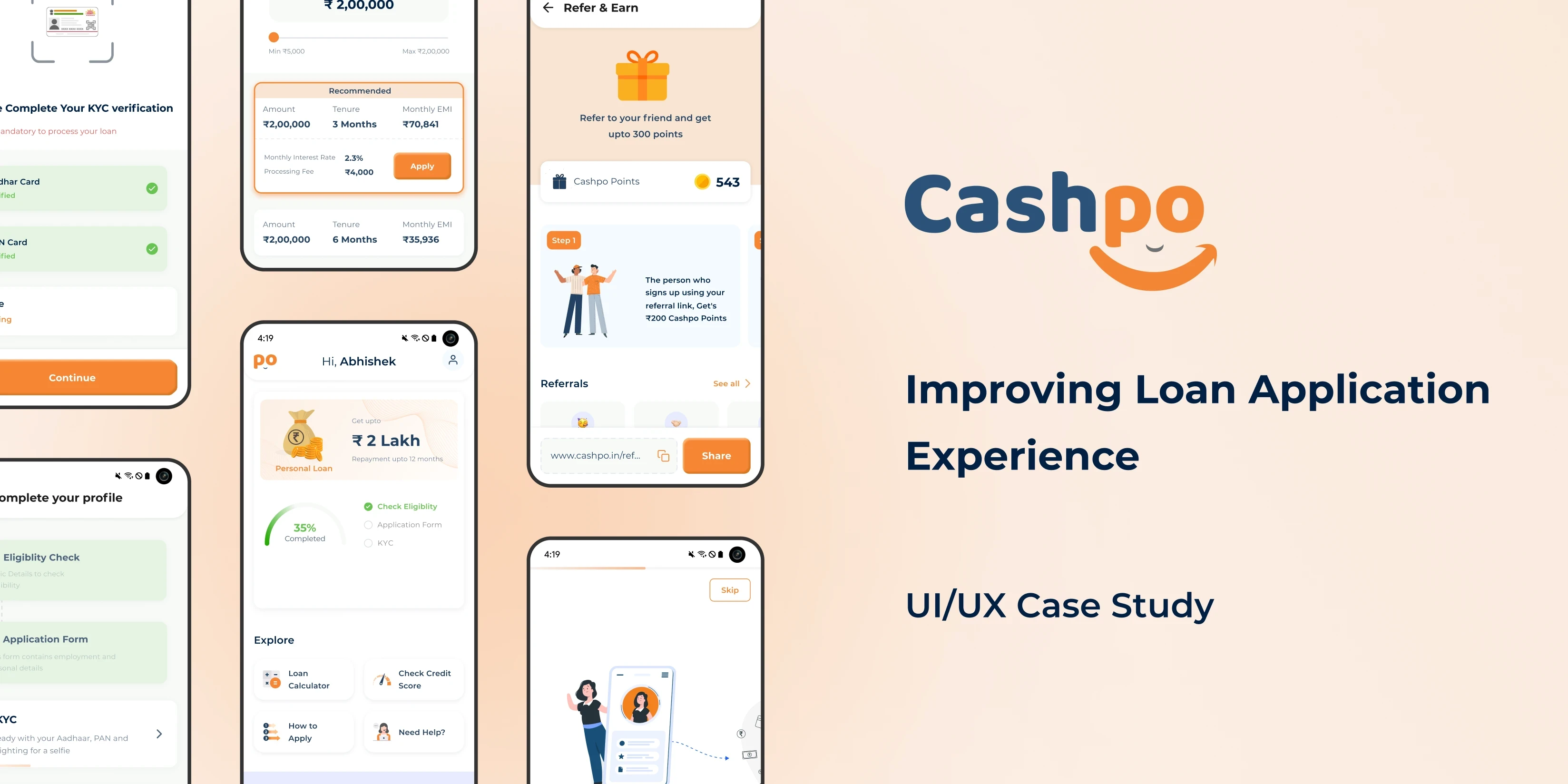
CashPo - UI/UX Case Study
40.2%
2.54 L users
• Fraudulent Loan Approvals
Fraudsters are securing loans through system vulnerabilities, undermining trust and platform stability.
• Unapproachable Tools and Actions
Users find platform tools difficult to access and use, leading to frustration and disengagement.
• Lack of Process Clarity
The loan application process is unclear, causing confusion and dissatisfaction among users.
• Insufficient Information on Next Steps
Users are not informed about subsequent steps after each action, reducing trust and increasing anxiety.
• Overall User Experience and Visual Appeal
The platform lacks visual appeal and user-friendly design, deterring user engagement.
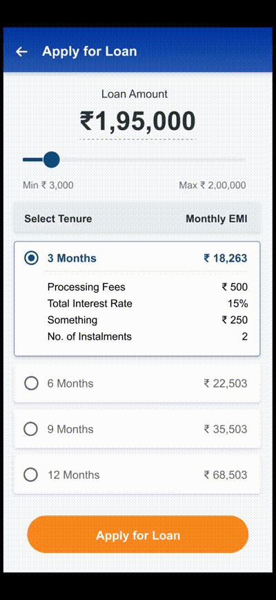
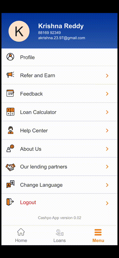
Some Screens of the CashPo Old App that includes the flow of the Loan Application form, Apply for Loan and Loan Process, and the last screen has other features are loan calculator, Feedback, Refer & Earns, and Help Center etc.

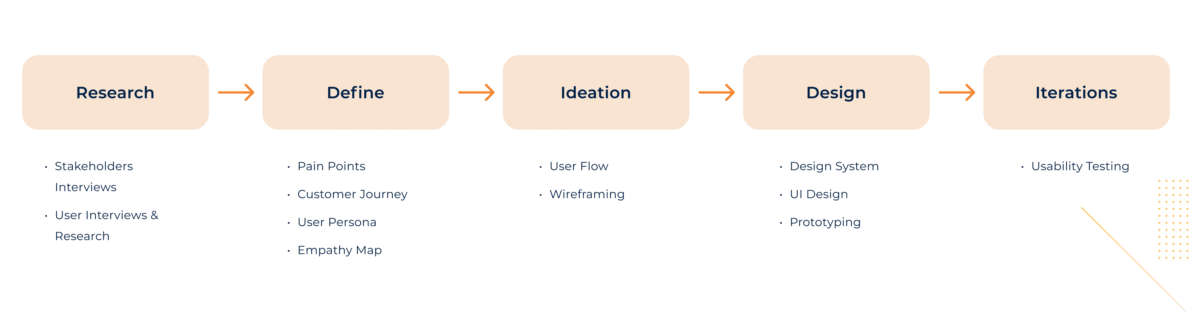
For this project, I researched the problem statement, did numerous iterations, received feedback, and built a prototype. There was a lot of back and forth between the stages.
I learned that there’s no linear design process that one has to follow and that taking feedback at different stages is very important.
Through 1-on-1 interviews with users in various loan stages (in progress, completed, rejected), I successfully conducted research to understand their needs and pain points, encountering a few switched-off phones (potential ❌fraud cases) but overall obtaining valuable results.
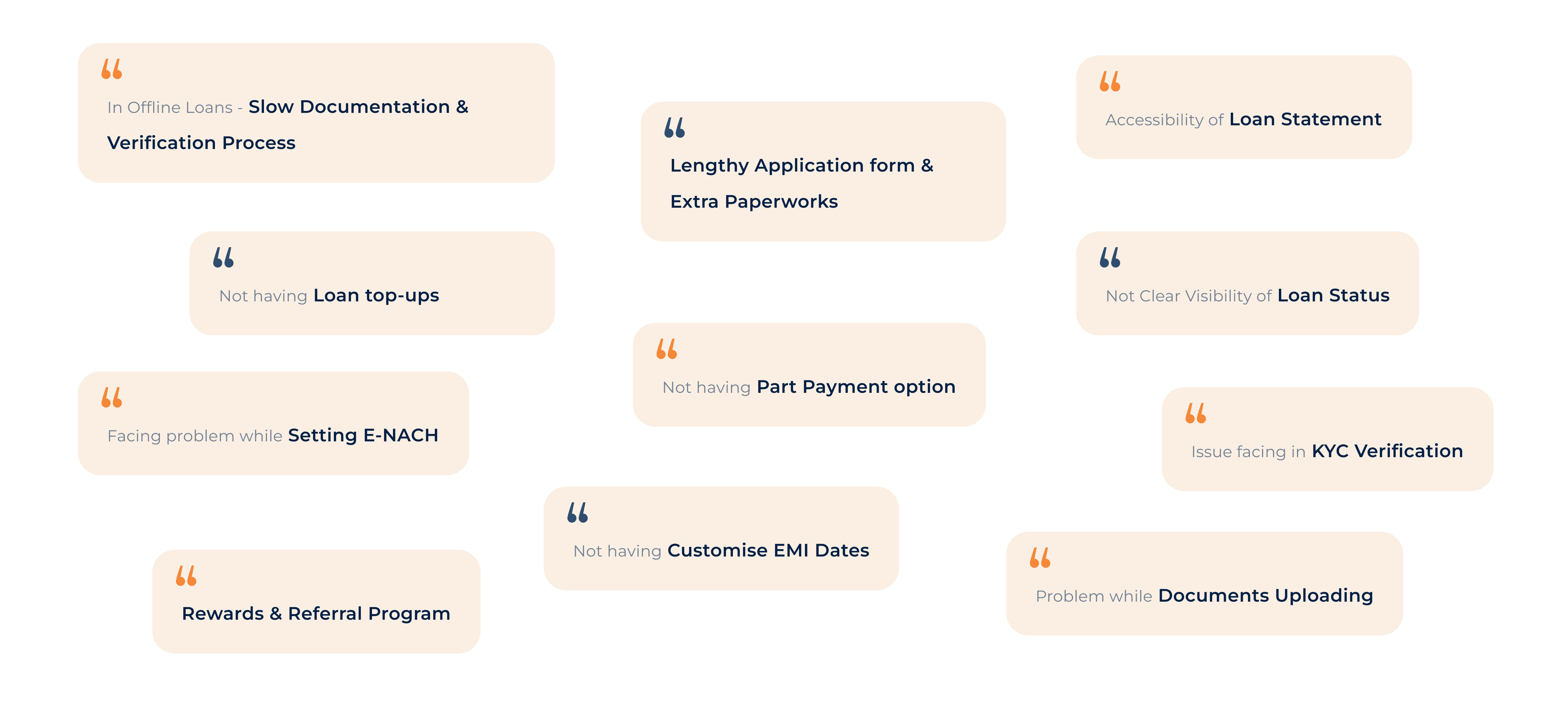
😣 Results and Pain Points
Based on research we got some pain points from users.
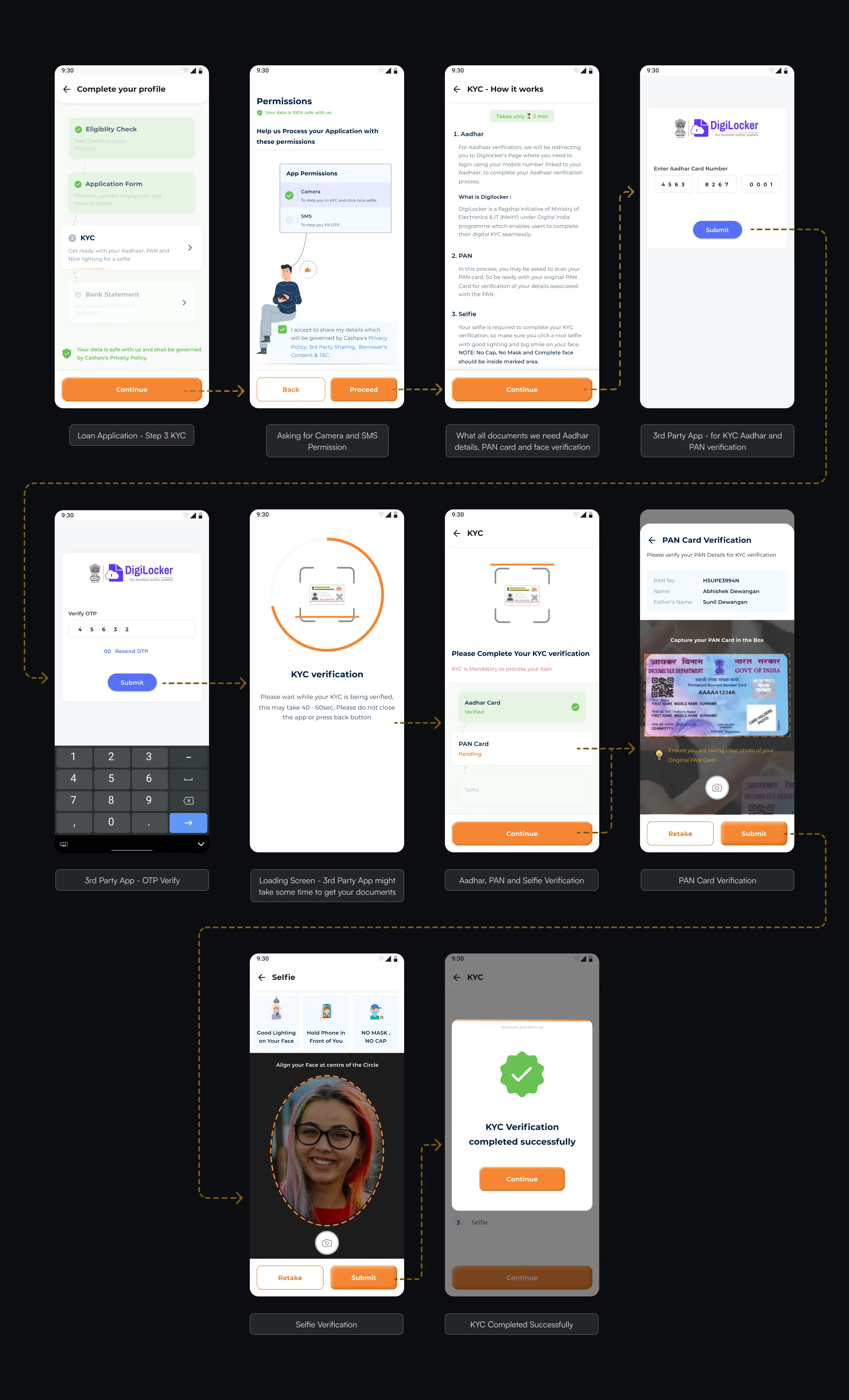
To secure the system and ensure loans are provided to the correct users, our system digitally verifies users' national ID cards (Aadhar and PAN) through an OTP process.
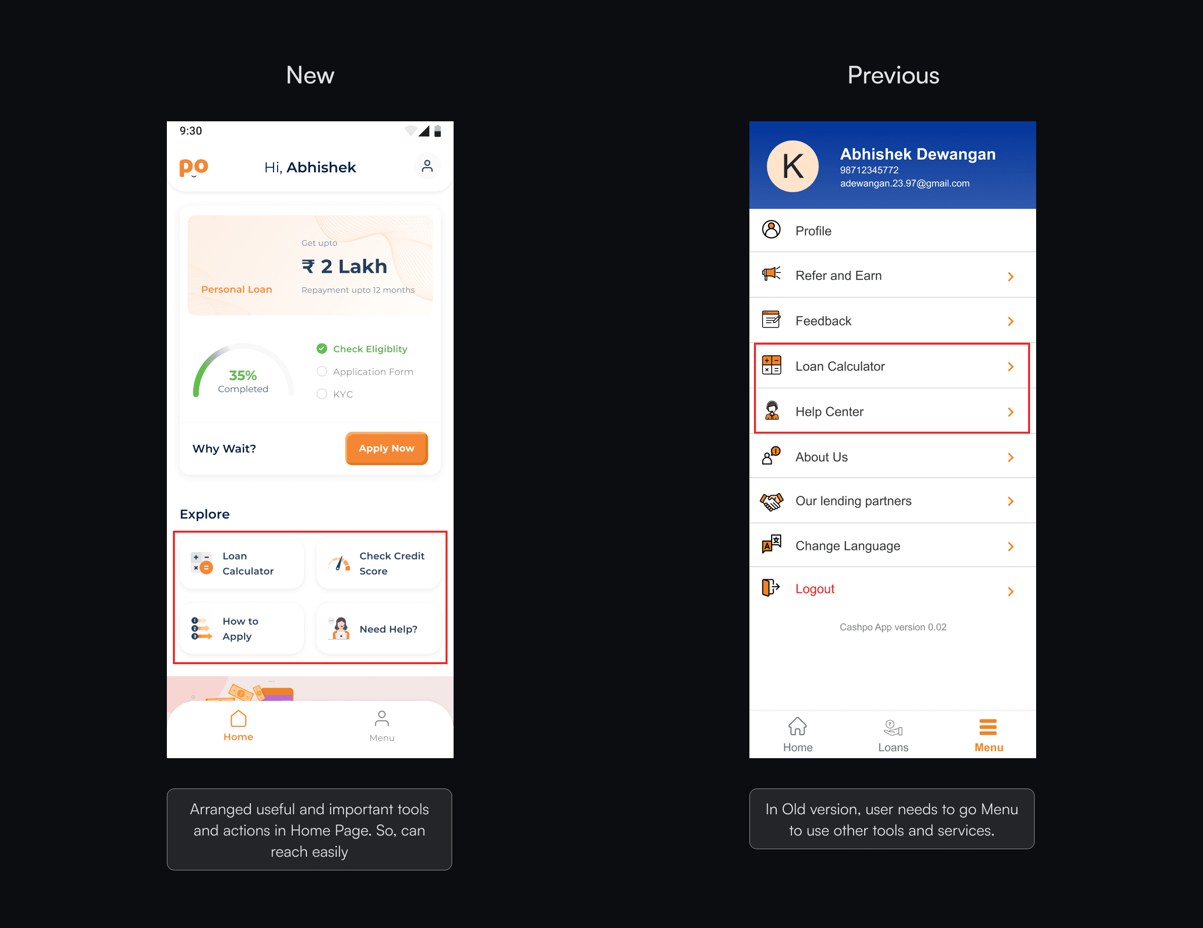
Certain tools and help sections, such as the loan calculator and "Need Help" section, were previously difficult for users to access directly.
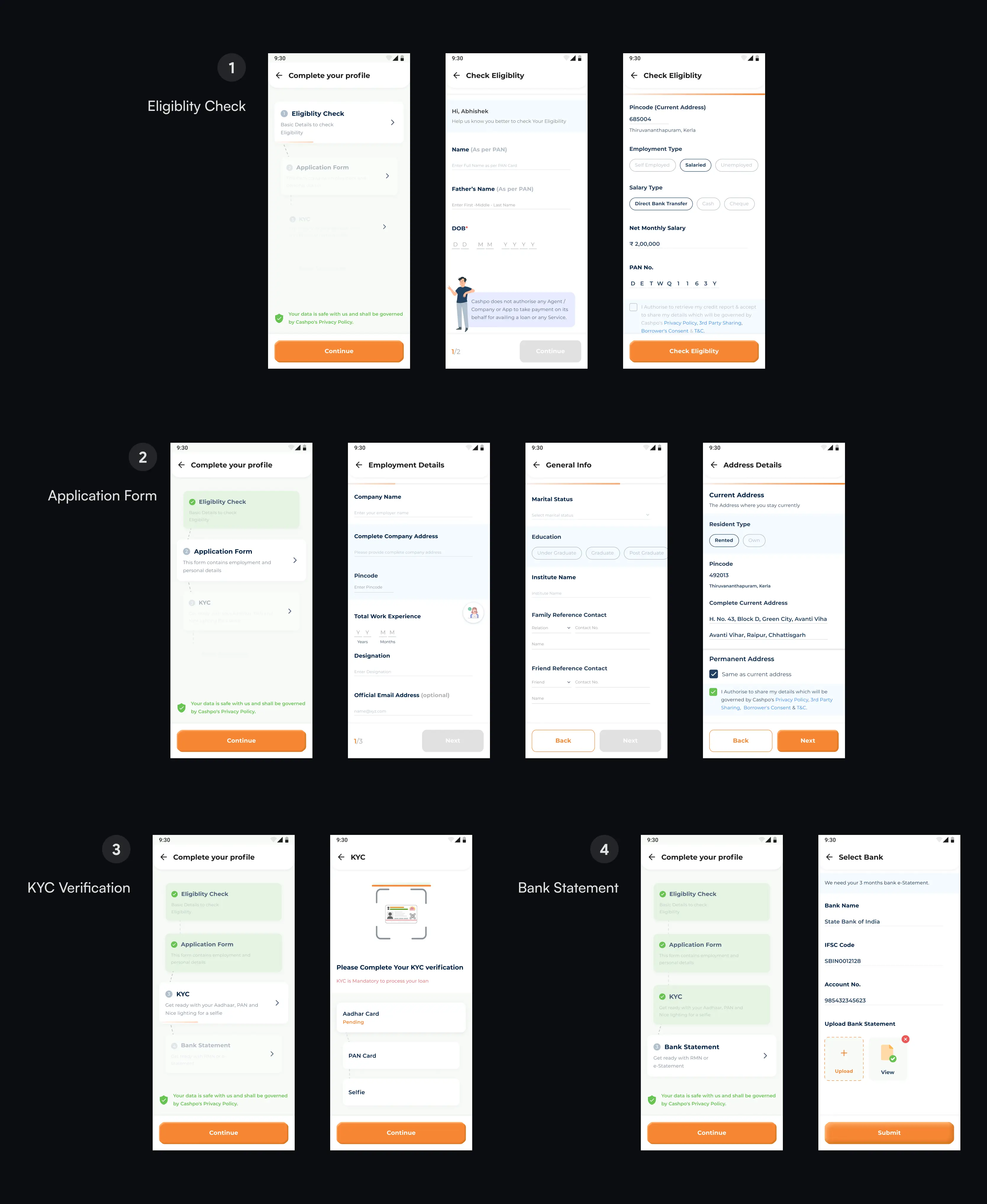
We reorganized all necessary information into four clear and distinct sections.
Previously, users were often confused about the next steps in the process, such as selecting a loan offer or understanding subsequent actions. We have now clarified the process to provide clear guidance on what to expect next.
We enhanced the UI to be clean and soothing, adding micro animations and interactions to make it more intuitive and visually appealing.
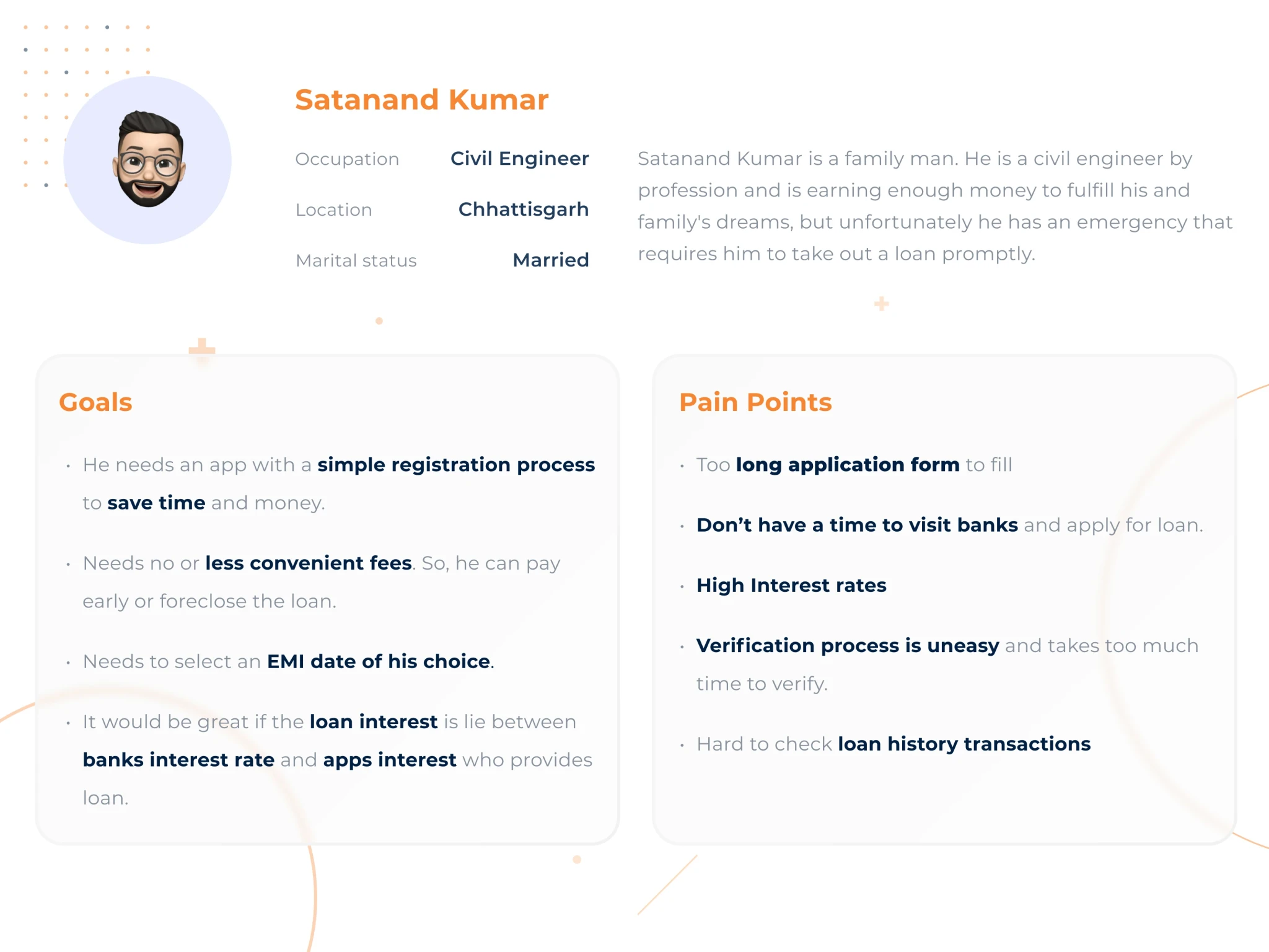
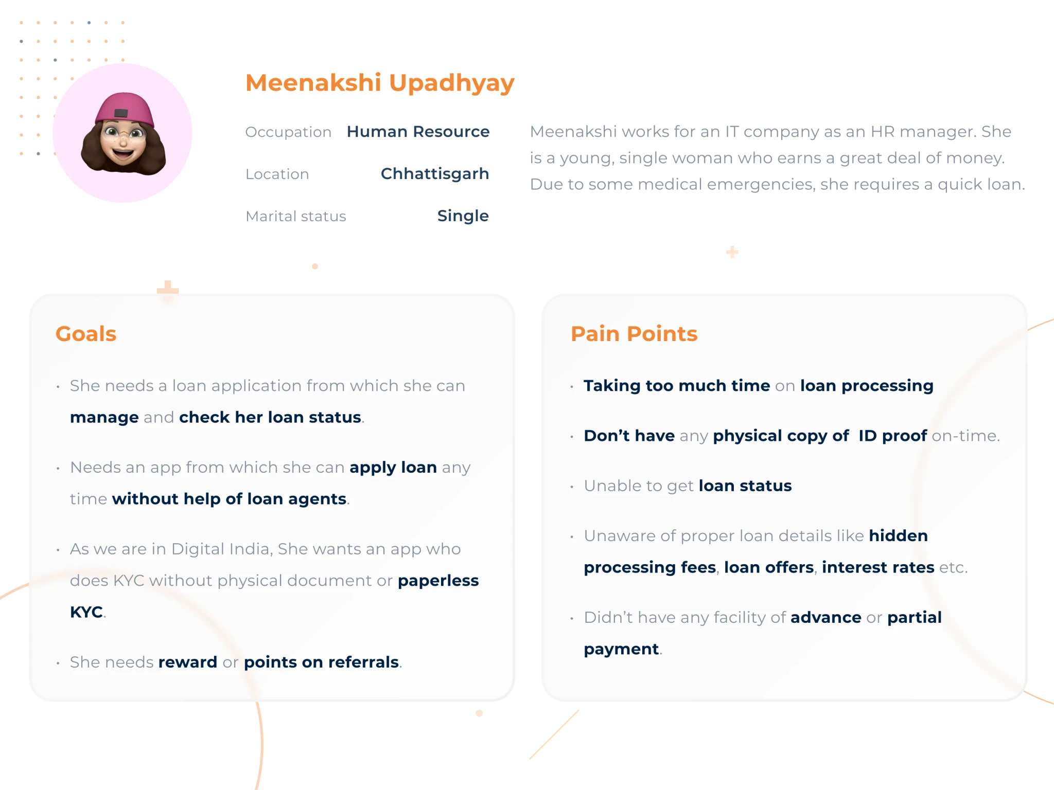
In order to better understand customers’ feelings and goals, I needed to analyze insights from my research into how customers used the existing app.
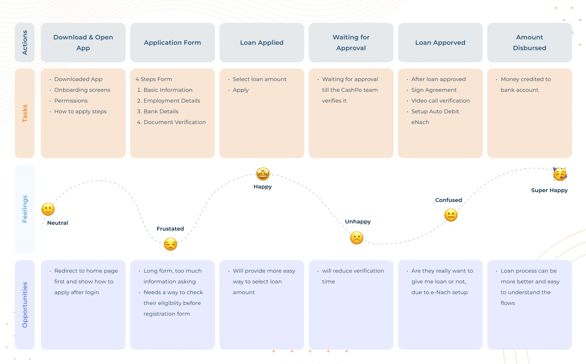
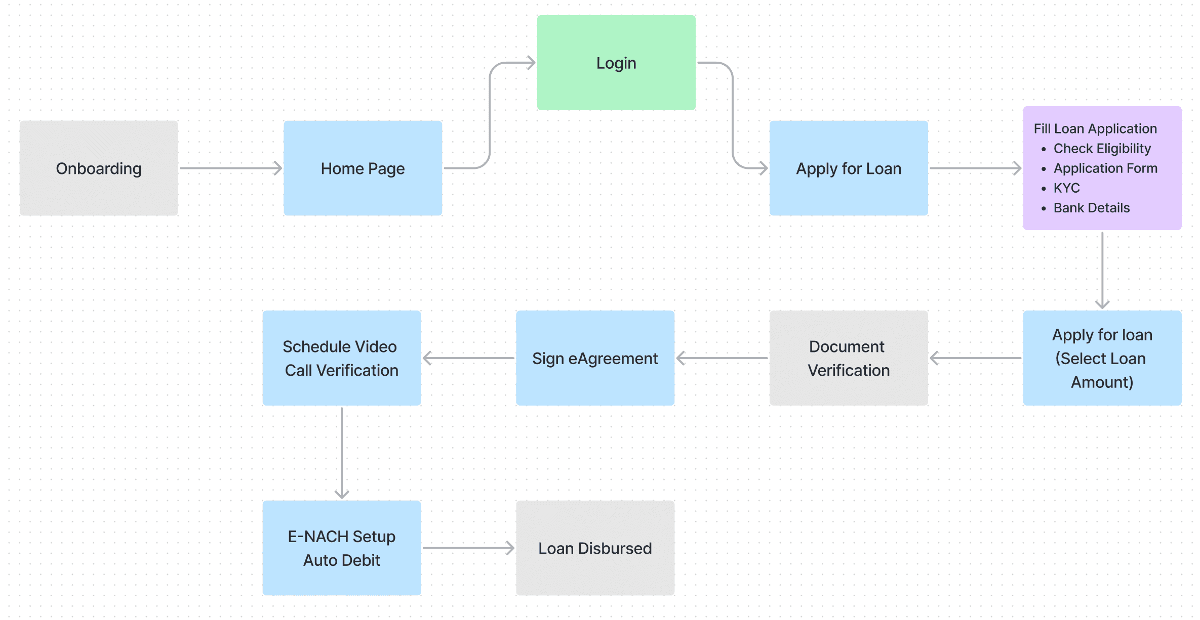
What the user has to do is, Login → Fill application form → Apply for a loan → 🥳 Congratulations your loan is disbursed.
• To secure the system and ensure loans are provided to the correct users, our system digitally verifies users' national ID cards (Aadhar and PAN) through an OTP process.
• Certain tools and help sections, such as the loan calculator and "Need Help" section, were previously difficult for users to access directly.
• We reorganized all necessary information into four clear and distinct sections.
• Previously, users were often confused about the next steps in the process, such as selecting a loan offer or understanding subsequent actions. We have now clarified the process to provide clear guidance on what to expect next.
• We enhanced the UI to be clean and soothing, adding micro animations and interactions to make it more intuitive and visually appealing.